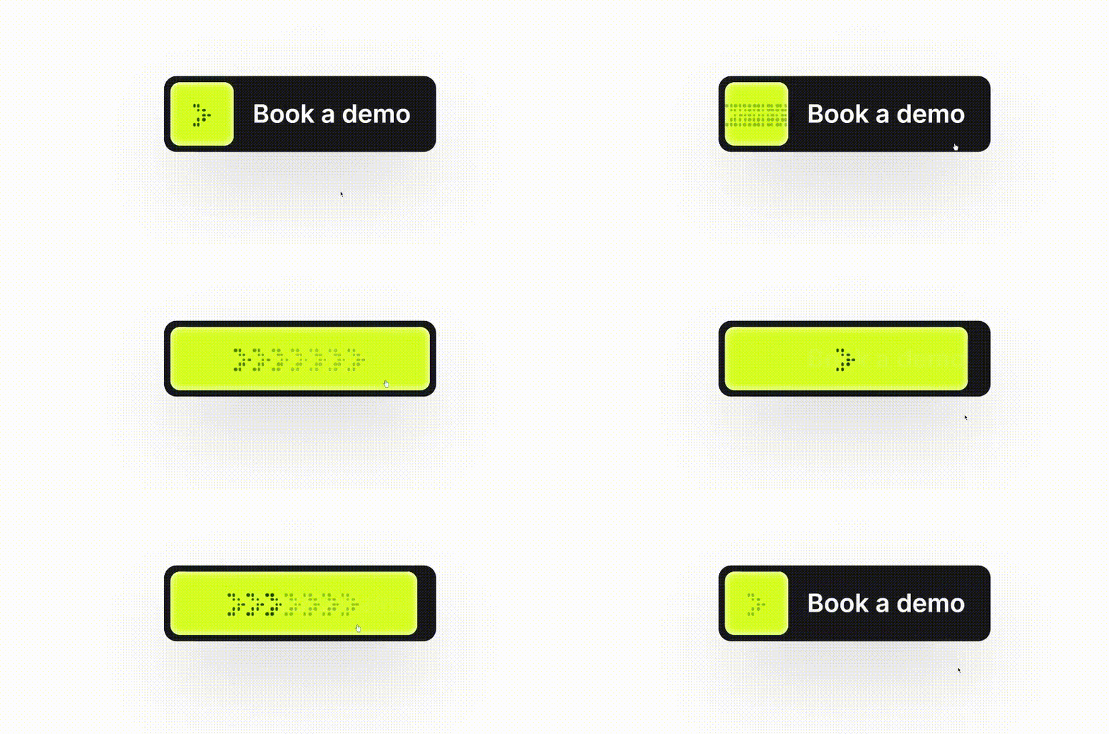
Animated Button component
CTA button with animation using pure js.

👀 💬 pic.twitter.com/8riLSj39l2
— Manu Arora (@mannupaaji) May 17, 2024
 While I knew I wont find any asset/SVG online, I had to make it myself from scratch where got the idea by GPT how to build it using CSS styles over divs by absolute positioning them.
const getArrowStyles = (index: number) => {
  const baseStyles = {
    height: '2px',
    width: '2px',
    borderRadius: '2px',
    backgroundColor: '#000',
  };
  const positions = [
    { left: 0, top: 0 },
    { left: '3px', top: 0 },
    { left: '3px', top: '3px' },
    { left: '6px', top: '3px' },
    { left: '6px', top: '6px' },
    { left: '9px', top: '6px' },
    { left: '3px', top: '9px' },
    { left: '6px', top: '9px' },
    { left: 0, top: '12px' },
    { left: '3px', top: '12px' },
  ];
  return { ...baseStyles, ...positions[index] };
};
Hover Animation
The hover animation is achieved through a combination of CSS transitions and React state changes. When the button is hovered, we trigger a series of class changes that reveal the full arrow container:<div className='hero-button-arrows absolute flex items-center
pointer-events-none overflow-hidden transition-all p-1
duration-500 group-hover:w-full group-hover:h-full
group-hover:left-0 group-hover:top-0 justify-center
h-full w-12 rounded-4 top-0 left-0 moving-arrows'>
{/* Arrow content */}
</div>The group-hover classes from Tailwind CSS are used to control the expansion of the arrow container on hover. This creates the effect of the arrows filling the button.
Pulsating Effect
The pulsating effect is created by using multiple layers of arrows that appear to move. This is achieved by rendering multiple sets of arrows and animating them:
{Array(8).fill(null).map((_, idx) => (
  <div key={idx} className={`moving-arrows-item relative w-3 h-3 ${idx === 0 ? 'block' : 'group-hover:block'}`}>
    {Array(10).fill(null).map((_, i) => (
      <div key={i} style={{ ...getArrowStyles(i), position: 'absolute' }} className={`wave wave-${idx + 1}`}></div>
    ))}
  </div>
))}
.wave {
  animation: wave 1.5s ease-in-out infinite;
}

@keyframes wave {
  0%,
  100% {
    opacity: 0.8;
  }
  50% {
    opacity: 0.2;
  }
}

.wave-1 {
  animation-delay: 0s;
}

.wave-2 {
  animation-delay: 0.1s; /* 0.2s delay for the second arrow */
}

.wave-3 {
  animation-delay: 0.2s; /* 0.4s delay for the third arrow */
}

.wave-4 {
  animation-delay: 0.3s; /* 0.6s delay for the fourth arrow */
}

.wave-5 {
  animation-delay: 0.4s; /* 0.8s delay for the fifth arrow */
}

.wave-6 {
  animation-delay: 0.5s; /* 1s delay for the sixth arrow */
}

.wave-7 {
  animation-delay: 0.6s; /* 1.2s delay for the seventh arrow */
}

.wave-8 {
  animation-delay: 0.7s; /* 1.4s delay for the eighth arrow */
}

.group:hover .moving-arrows-item:first-child {
  display: none;
}
Each set of arrows is given a different animation delay, creating the illusion of a continuous flow of arrows. The CSS animations (not shown in the provided code) would handle the actual movement of these arrow sets.
Here's the source code, I hope you like it : )
Please do check out other crafts as well. Any feedback is well appreciated.🥰